Dummy data are better
than no data.
“Dummy data” refers to anonymized or randomized information used in designs instead of actual data. In graphic design, this is often referred to as “lorem ipsum”. The similarities between “dummy data” and “lorem ipsum” extend beyond their use cases and also relate to common fallacies.
The following list highlights three problems related to dummy data and provides rapid solutions for each.
Problem 1. Dummy Data is Detached from the Business Context
When designing a website or a BI Dashboard, it is important to consider the content and business objectives. Dashboards should provide the necessary information for decision-making and support the overall operation of the business. Unlike real data, dummy data lacks the relevant business aspects. It does not reflect true key performance indicators (KPIs), and products/services, or provide meaningful information for decision-making
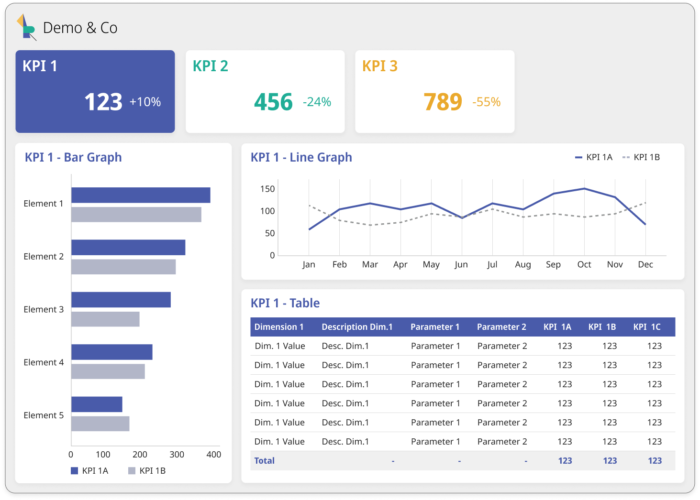
If you share the above design during corridor tests, people will only be able to evaluate its style. If you share it with stakeholders, who are not familiar with the concept of “dummy data”, it will bring confusion about what information it represents. For them there is no chance to make content validation or check how this will support business decisions. That’s because all the names are very generic: dimension labels, metrics names, amount of content, and items in the graph legends.
Solution 1: Dummy Data connected to the business case
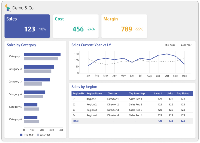
Understand the end-users business processes and the information they analyze. Use real names for metrics and dimensions in your designs. Go beyond labels and consider the expected number of items in each section and the relationships between dimensions. This will immediately make your design more understandable for end-users and stakeholders.
Below corrected example with just subtle changes in regards to this solution:
Problem 2. Dummy Data underestimates the importance of screen real estate
Wireframes should primarily demonstrate the functionality of the end product. However, visual aspects, such as realistic sizing and element positioning, should not be overlooked. Neglecting these aspects at the wireframe stage can make it impossible to address them in high-fidelity mockups. The examples provided in the document are closer to high-fidelity mockups than wireframes but still have sizing issues.

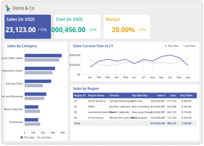
For instance, the numbers “Sales,” “Cost,” and “Margin” are randomly placed at the top of the screen without any context. With realistic data, these numbers would typically represent sales in USD or units, cost in monetary value, and margin as a percentage or monetary value. Additionally, if the top KPIs aggregate at the company level, they would not be as small as shown in the example, and end-users would prefer more precise values.
However, when we attempt to make this information more reasonable, suddenly no items fit within their placeholders.
Solution 2. Reasonable dummy data.
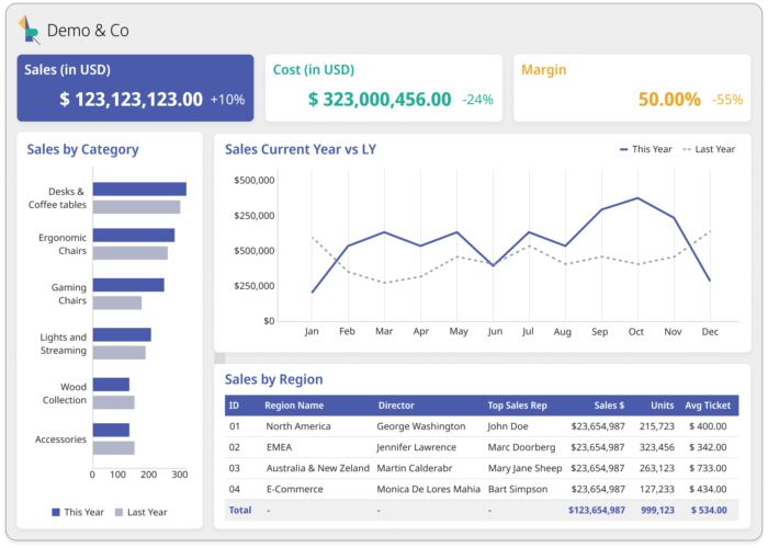
Validate units, number of digits, and decimal places in every visualization. Double-check the spelling of labels. If you use business-specific names, such as product names or lines of business, ask the client for sample data or a query that includes the longest names. This due diligence is necessary when transitioning from wireframes to high-fidelity designs. Also, consider if any abbreviations are acceptable, such as using “CY” for “Current Year” or “Emp.” for “Employee,” as this can help optimize the design.
Problem 3. Dummy Data are missing alignment with calculations, dashboard logic, and business definitions.
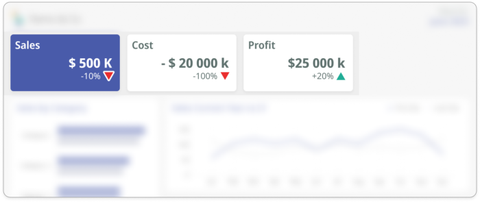
While it may seem excessive to be extremely precise in the design phase, it is important to consider the expectations of stakeholders and end-users. They may not tolerate examples with incorrect data calculations. Therefore, it is crucial to ensure the mathematical accuracy of your designs. For instance, it is impossible for the cost of goods sold to have negative values. Therefore, the profit should not be five times greater than sales.
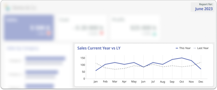
Equally important is the logic of information. If a dashboard is designed to display data up to the current month (let’s say June 2023), the data points should not extend beyond that month. If the data points show information beyond the specified date (let’s say till the end of the year), end-users may become confused or make false assumptions that it is a forecast.
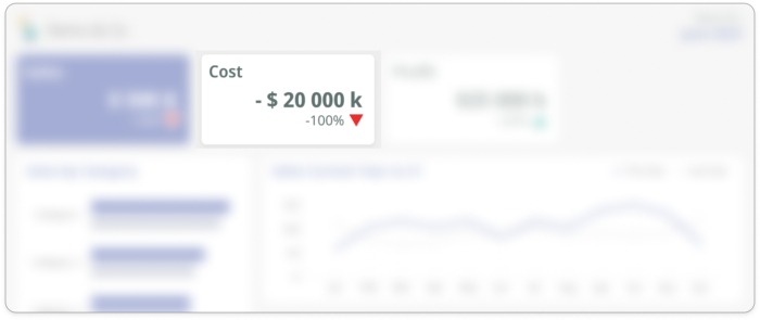
Furthermore, it is essential to align your designs with business definitions. If you are using thresholds in your dashboard to indicate a positive or negative impact on the business, make sure to verify that logic with your client. Although in many cases, an increase in a parameter corresponds to a positive impact on the business, there are exceptions. For example, consider the time required to achieve something, costs, or the number of items that require action or generate a loss in sales.
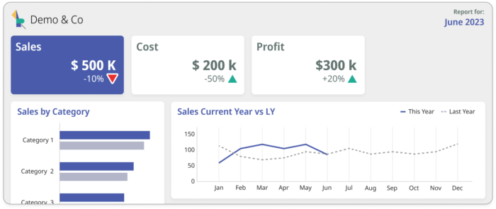
Solution 3. Dummy Data that reflects logic and calculation of the final product.
When inserting data into wireframes or hi-fi mockups, it is important to be meticulous. Consider researching KPI calculations, it can be helpful to visit resources such as the Investopedia Financial Terms Dictionary or similar references. If you’re unsure, don’t hesitate to verify the calculations with end users. Business measures can vary between companies or even within different regions of the same company, therefore it’s ok to ask and verify. The same applies to thresholding, when proposing any iconography or color coding based on KPI values, ask for verification. Be very consistent and follow your agreements with the client on what information to include. For example number of data points in time series, level of data aggregation,
Summary
Effective dummy data creation involves thoughtful consideration rather than random generation. Stakeholders’ needs should guide the process, serving as a basis for design decisions and functional validation. Key principles for creating smarter dummy data include:
- Reflect Real Business Measures: Incorporate actual business metrics and dimension names to align with the client’s business case.
- Randomized Yet Reasonable Content: Anonymize data while ensuring it remains reasonable, including units, digit count, and decimals. Consider here the impact of this random content on design sizing.
- Ensure accuracy and Coherence: Meticulously verify the mathematical accuracy and business coherence of data representations. Consistency with agreed-upon dashboard information is crucial to prevent client distractions during the design process.
In conclusion, the purposeful creation of dummy data, tailored to stakeholders’ needs, enhances the effectiveness and validity of design.
